KickMap: Its Design History, Plus My Review
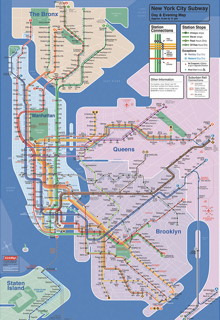
 Eddie Jabbour’s KickMap — an imaginative redesign of the New York subway map that tries to address the confusing and complex network of express and local lines — first came to my attention in 2007. Since then, the KickMap has migrated to the iPhone/iPod touch/iPad platform, and is available in free and paid ($2.99) versions, the latter coming in separate iPhone and iPad variants. All told, more than a quarter million people, Jabbour says, have downloaded a KickMap app.
In a must-read post on O’Reilly Radar, Jabbour describes what went into the design of the KickMap — the inspirations, the constraints, the trade offs, the multiple iterations that got him to his final version.
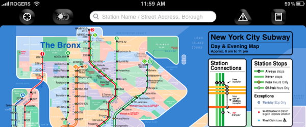
![]() Because KickMap comes in an iPad version, I downloaded it to have a look for myself. There is no question that this is a map originally designed for print — static and not interactive — that has been adapted for mobile devices, rather than an interactive map application that has been designed from the ground up. But the app, at least the paid version, is a lot more than an image viewer with multitouch gestures.
Because KickMap comes in an iPad version, I downloaded it to have a look for myself. There is no question that this is a map originally designed for print — static and not interactive — that has been adapted for mobile devices, rather than an interactive map application that has been designed from the ground up. But the app, at least the paid version, is a lot more than an image viewer with multitouch gestures.
- The main differentiation between the free and paid KickMaps is that the paid version includes a map of the limited late-night/early-morning service. This can be toggled with a button or can be set to automatically show the appropriate map based on the time.
- Another button reveals service alerts.
- A third button provides a close-up of the map legend explaining the different classes of station stops. Incredibly handy: how many times when zooming in to a scanned map have I had to pan like mad over to the legend to figure out what I was seeing, then try to find what I was looking for?
- There is a locate button that pops open a Google Maps interface showing you the distance from your location to a given subway stop (on the iPad this map is resizeable). Since I’m about 350 miles from the New York subway my ability to test this feature is somewhat limited.

In other words, there is considerable effort here to use the iOS interface to create a useful navigation tool that goes beyond the original static map. How effective it is I will have to leave to New Yorkers to determine, but a quarter million downloads suggests that quite a few of them have already voted. From my standpoint (for what that’s worth), the map’s innovative design and the additional features make it worth the $2.99 purchase price.
Previously: Eddie Jabbour’s New York Subway Map; Mark Ovenden: The French (Re-)Connection.

Comments
blog comments powered by Disqus