Global Temperature Anomalies
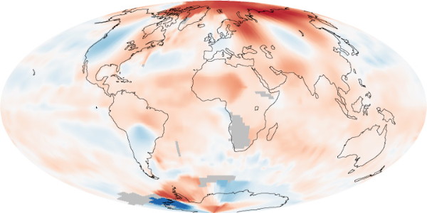
A map based on temperature records assembled by NASA’s Goddard Institute for Space Studies “shows global surface temperature anomalies for May 2010 compared to average temperatures for the same time of year from 1951 to 1980. Above-normal temperatures appear in shades of red, and below-normal temperatures appear in shades of blue. Gray areas indicate areas of insufficient data.”

Comments
blog comments powered by Disqus