About BART’s New System Map
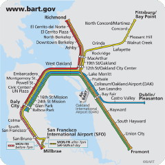 Rachel Berger compares BART’s new, geometric system map with its wigglier, geographically accurate antecedent, providing the now-familiar (for those of us following the debates on subway system map design) context from other cities’ subway systems. Honestly, I’m not sure the BART system is complicated enough for it to make much difference, and Rachel has, as a result, some mixed feelings about the change, though as a designer she had issues with the old map.
The BART system, with five lines and forty-three stations, is simple. The new map feels inauthentic. Lines have been straightened for straightness’s sake, not to solve design problems. The BART map gained legibility but lost a rare hectic energy. Now that the old map is nearly gone, I realize how wonderful it has been to be confronted by a poetic, painterly map, by a map that makes me uncomfortable.
Via Mark Ovenden.
Previously: BART Maps Go Linear.

Comments
blog comments powered by Disqus