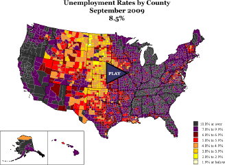
County-by-County U.S. Unemployment Map
 Via Maps-L, LaToya Egwuekwe’s animated map of county-by-county unemployment rates in the U.S. from January 2007 to September 2009. I quibble that there is no slider, but the map is well done. (Am I right in guessing that this was a school assignment?)
Previously: WSJ Map of U.S. Unemployment; Another Animated Map of U.S. Job Losses; Slate Maps U.S. Job Losses; U.S. Unemployment and Job Losses; Mapping the Recession and Stimulus.

Comments
blog comments powered by Disqus