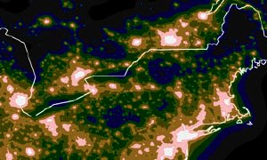
Testing Light-Pollution Maps Redux
 Tony Flanders continues his critique of light-pollution maps; this time, he notes that the brightnesses of the respective colours are misleading: “the orange zone appears distinctly darker than the green zone, belying the fact that skies are in fact 9× brighter in the orange than in the green.” He tweaks the maps to try to compensate, reducing the brightness of green and yellow. Truth be told, while we may know intellectually that there is less light pollution in a green zone than in an orange zone, the difference in brightness of the map colours is problematic; but, at the same time, the colours make for a handy reference.
Previously: Testing Light-Pollution Maps; Light Pollution Maps.

Comments
blog comments powered by Disqus