New York Times Immigration Explorer
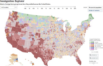
Just one more New York Times interactive map, I swear (at least for today), but this one is fantastic. It shows U.S. immigration patterns since 1880: where immigrants came from, and how much of the population (per county) they represent. It’s very interesting to see how this changes over time (except in Maine, where most foreigners seem to have always been Canadian). The screenshot shows the largest foreign-born group (by region) in each county; you can also select a specific group (Canadians, Czechoslovaks) and see where they settled. Thanks to Andy Anderson for the link.

Comments
blog comments powered by Disqus