Mapping Popular Locations in Online Maps
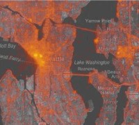 In a workshop paper called How We Watch the City: Popularity and Online Maps (PDF), Danyel Fisher of Microsoft Research describes how he generated a heat map based on the server logs for Virtual Earth’s image tiles. The brighter the point on the map, the more that tile was accessed — a rough guide to what people were looking for. At least on Virtual Earth, and at least for eight months in 2006. Via Geobloggers.

Comments
blog comments powered by Disqus