Travel Time Maps
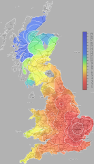
 mySociety’s travel-time maps demonstrate a way to use coloured maps with contour lines to show travel times, taking as examples rail travel and driving times from points in Cambridge, Edinburgh and London (at right, rail travel time from Cambridge, with contours at one-hour intervals). It’s an effective way to visualize something that isn’t necessarily obvious. The site outlines their methodology, data used and potential next steps. Via Boing Boing.

Comments
blog comments powered by Disqus